Data Analysis
Power BI
This is an increasingly popular reporting and analysis software package that can be used from the cloud. The examples below use the Cookie Creations dataset to give insights into sales behaviour using a variety of charts that can be interactived with.
This is an increasingly popular reporting and analysis software package that can be used from the cloud. The examples below use the Cookie Creations dataset to give insights into sales behaviour using a variety of charts that can be interactived with.
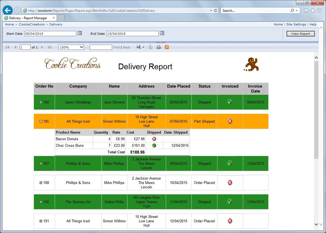
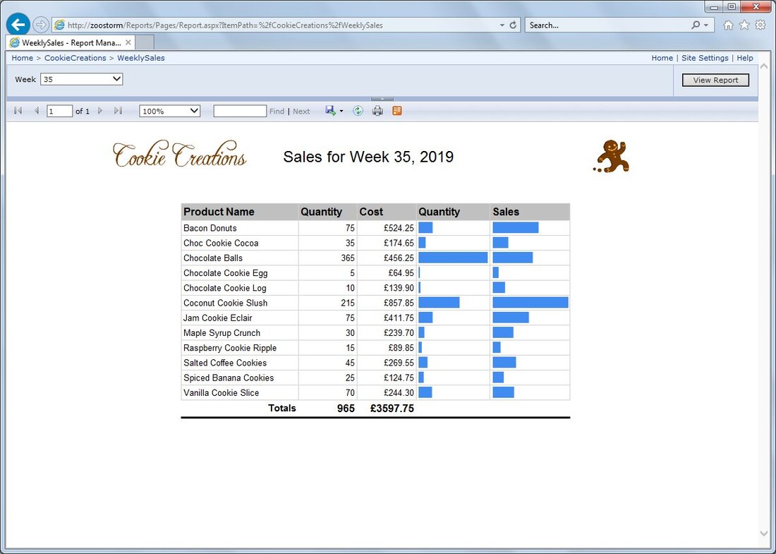
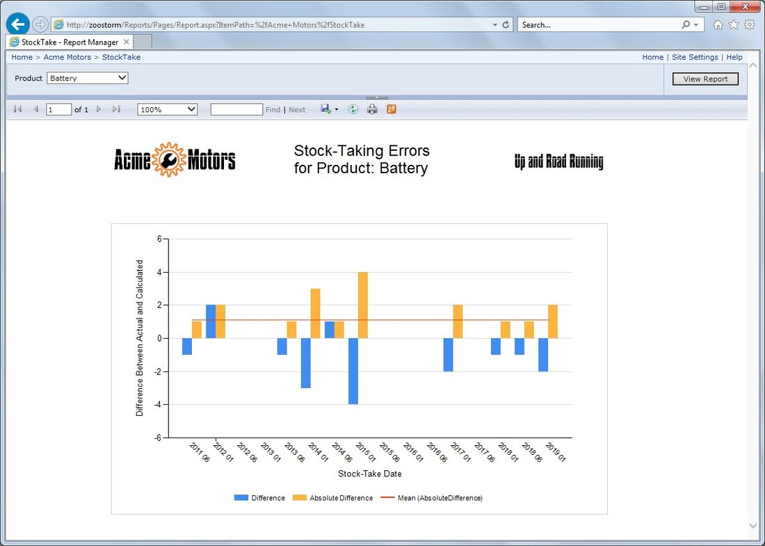
Sql Server Reporting Services
Built into Sql Server is the ability to deploy reports to a web browser to enable fast up-to-date information for users.
Excel Analysis
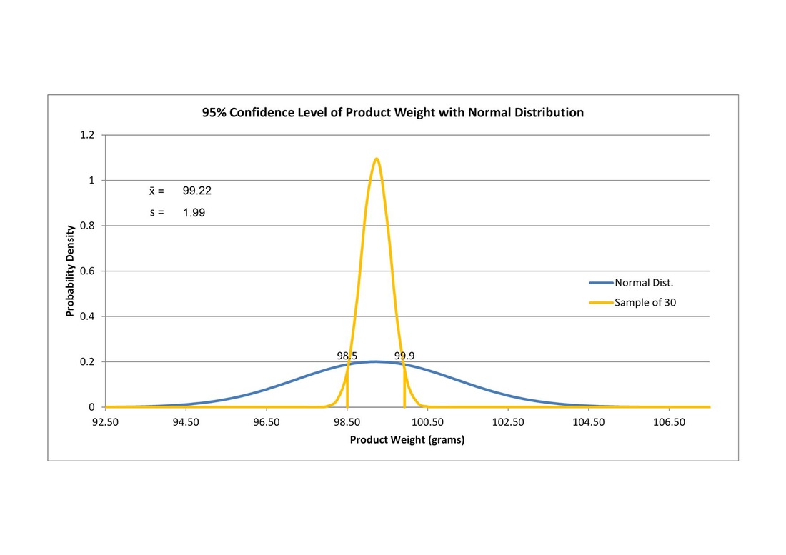
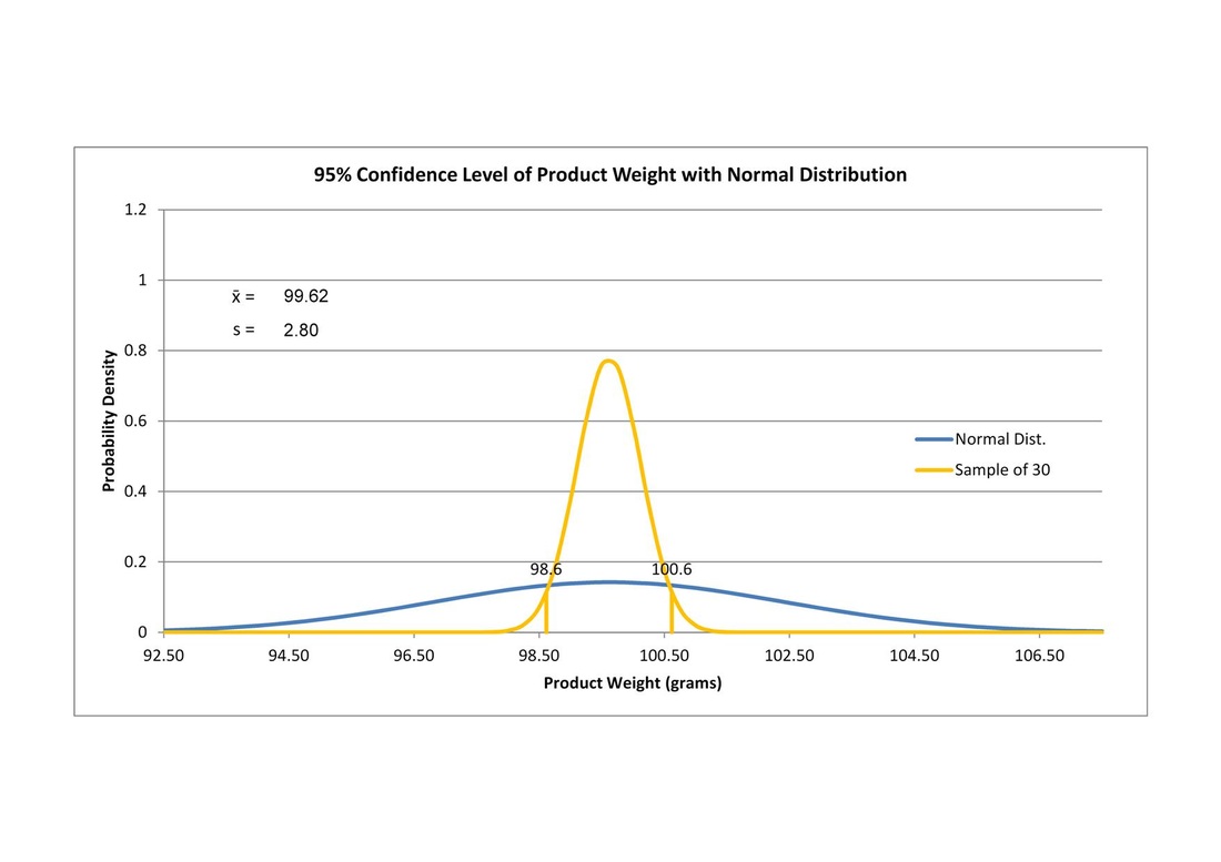
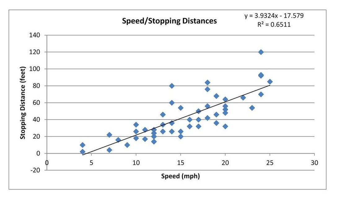
Statistics can be used as an essential part of spreadsheets when the need for sampling is necessary. The first two examples below show how samples of product weights can be used to show how confident we are that our sample mean lies in relation to the overall population. The first chart shows a slim distribution of weights while the second chart shows more variance, this could mean the equipment needs checking although overall the weights are fairly consistent. If only a low number of samples is possible then a t-distribution will give a more appropriate margin of error in our confidence. Also shown is a simple regression plot for stopping distances at various speeds, with further analysis this can help predict values. Other analysis methods include Multiple Regression, ANOVA, Chi Square tests, Confidence of Variance and Margin of Error.
Analysis in R
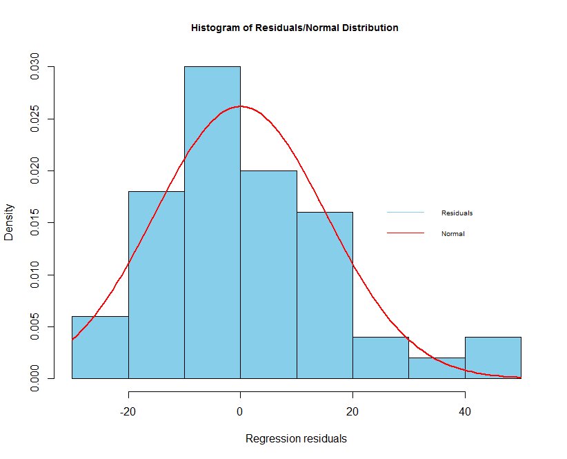
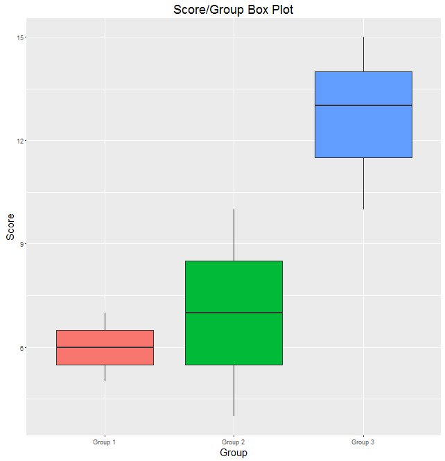
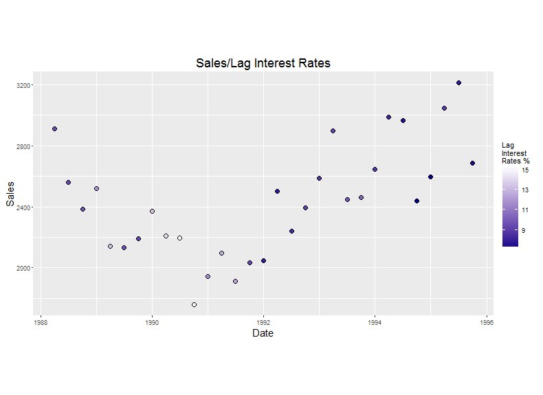
Using a statistics package we can go beyond Excel's limitations and produce significance testing as well as more graphical representations. Such tests can include normality testing, equality of variance, heteroscedasticity and ANOVA post hoc analysis. Graphically we can compile composite plots of histograms and curves to visualise how normal your data is, box plots are an ideal way to get an initial eyeball of different groups and also shown is a scatterplot for a sales variable against a date variable and also utilising lagged interest rates as a third variable.
Using a statistics package we can go beyond Excel's limitations and produce significance testing as well as more graphical representations. Such tests can include normality testing, equality of variance, heteroscedasticity and ANOVA post hoc analysis. Graphically we can compile composite plots of histograms and curves to visualise how normal your data is, box plots are an ideal way to get an initial eyeball of different groups and also shown is a scatterplot for a sales variable against a date variable and also utilising lagged interest rates as a third variable.
Exploratory Analysis
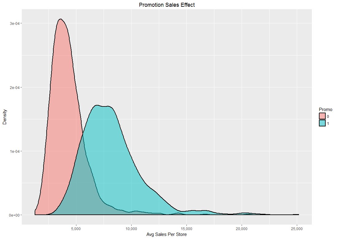
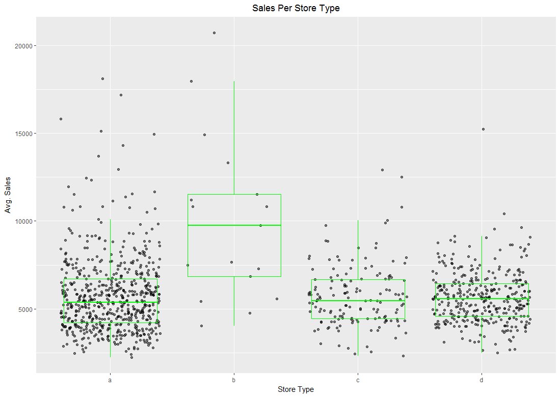
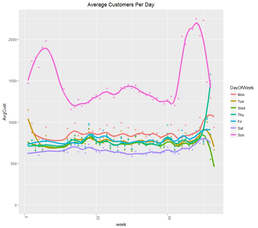
Using data from a Kaggle competition, the following plots have been produced. The competition used data from Rossmann which is Germany's 2nd largest drug store chain. The first plot is of a density type which shows how sales increase at times when stores have a promotion on. The next plot along is a jitter plots which displays the average daily sales for each store type. While there looks to be variation in in the 1st, 3rd and 4th stores, the overlaid boxplot shows they are actually very similar. The 2nd store type look to be of a larger superstore outlet. The final plot shows how sales increase rapidly on a Sunday during the beginning and ending of a year, perhaps this is due to an increase in ailments when most other shopping stores are closed as is usual in Germany.
Using data from a Kaggle competition, the following plots have been produced. The competition used data from Rossmann which is Germany's 2nd largest drug store chain. The first plot is of a density type which shows how sales increase at times when stores have a promotion on. The next plot along is a jitter plots which displays the average daily sales for each store type. While there looks to be variation in in the 1st, 3rd and 4th stores, the overlaid boxplot shows they are actually very similar. The 2nd store type look to be of a larger superstore outlet. The final plot shows how sales increase rapidly on a Sunday during the beginning and ending of a year, perhaps this is due to an increase in ailments when most other shopping stores are closed as is usual in Germany.
Cluster Analysis
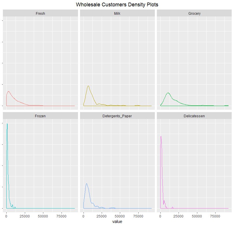
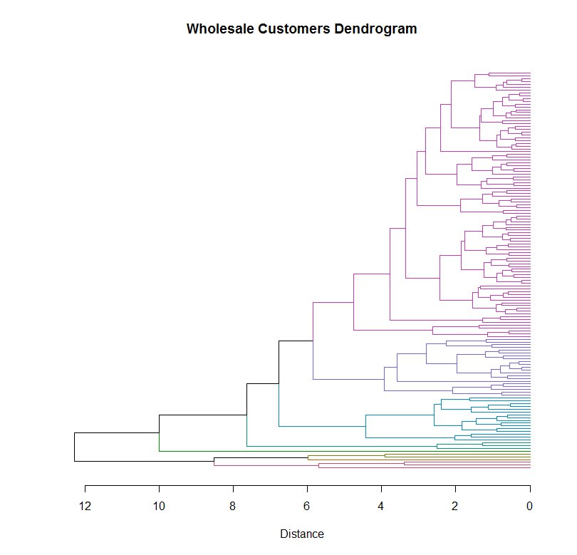
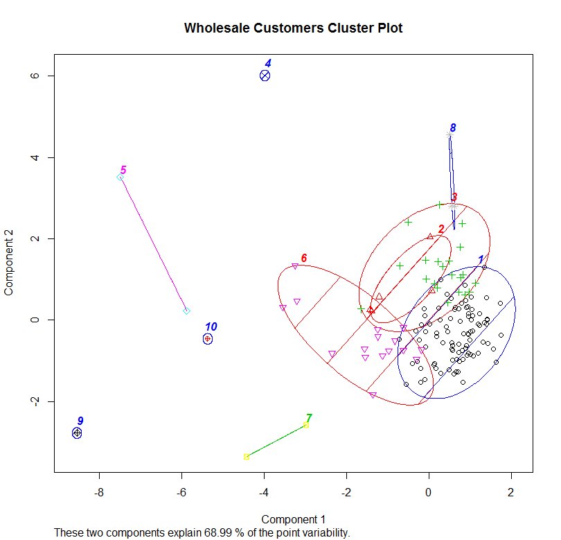
Clustering is a method that attempts to group together similar data objects. The data set used is from a wholesaler that supplies a variety of goods for smaller retailers, we will look to partition the customers into groups for the sake of potential marketing. The first plot shows an overview of the product categories and density of the sales. The data points for each customer are grouped using a distance algorithm which gradually links smaller clusters into larger ones until all the data points are combined into a single cluster. This can be seen in the dendrogram plot which shows the distances between each cluster when they are joined. This cluster can then be partitioned into smaller clusters depending on how granular your needs are. The last plot gives a rough guide to visualising how the clusters are represented, this is done using the two categories that best explain most of the variation in the clusters.
By analysing the aggregated data of the clusters it can be concluded that the Group 1 cluster purchases the least goods. Group 3 tends to put a larger emphasis on Fresh goods, while Group 6 has a larger proportion of purchases of Milk, Grocery and Detergents_Paper. Group 2 seem to more specialise in Delicatessen while the remaining clusters are much smaller and are big spenders in various areas.
Market Basket Analysis
This is a technique used by retailers to discover associations between items. It works by looking for combinations of items that occur together frequently in transactions, providing information to understand the purchase behavior. Uses for this analysis include; product placement, cross-selling and marketing promotions. The outcome of this type of technique is a set of association rules that can be understood as “if this, then that”.
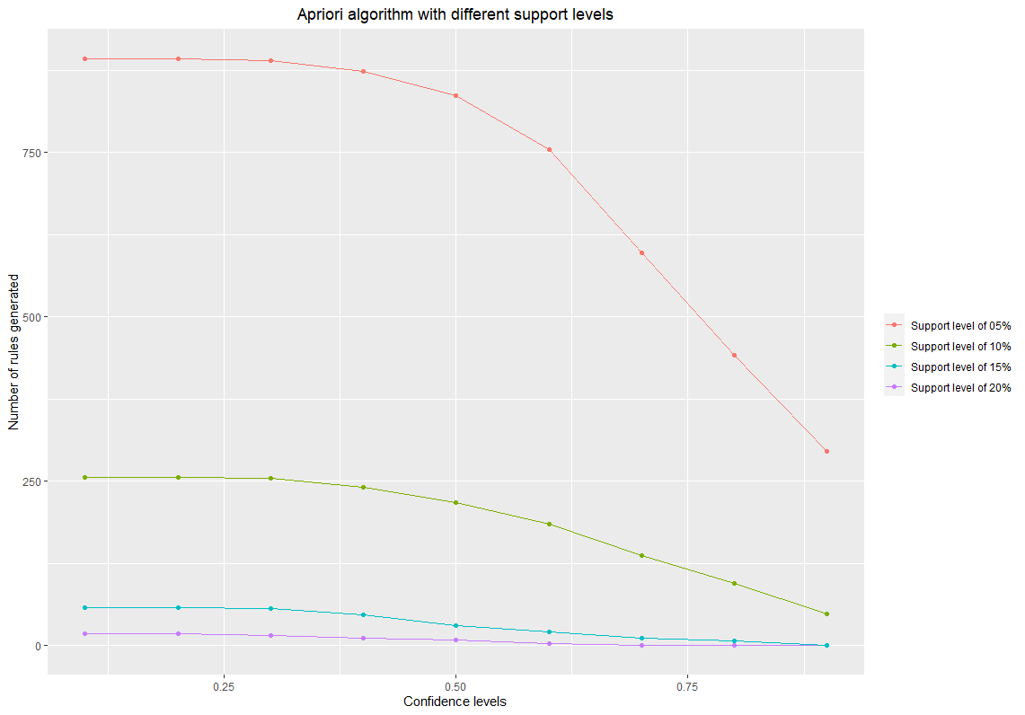
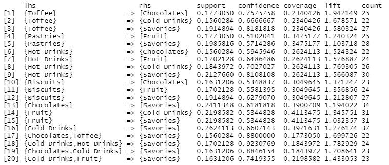
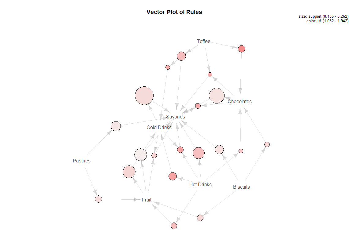
The left plot shows the generating of association rules for differing minimum popularities of the products (support), this is coupled with the minumim probabilities that an item will be included in a transaction given another product will also be present (confidence). As the data is categorical, only a small number of rules is required and this will be more manageable. So using a support level of 15% and confidence of 50% we can produce a set of 20 rules as shown in the middle pane. The first entry shows that if Toffee is in a transaction, then there is a 75% chance that Chocolates will also be present in that shopping basket. The 'lift' shows that Toffee and Chocolates are almost twice as likely to be in the same transaction than by random chance and are heavily associated with each other. The plot on the right gives a visual of these associations along with product popularity. It can be seen that Savouries are involved in a great many of the transactions and while Toffee and Chocolates and heavily associated, they are possibly not selling as well as they could be, possibly due to the products being far apart. The large circles for Cold Drinks -> Savories and Chocolates -> Savories show that they are being well utilised.
|
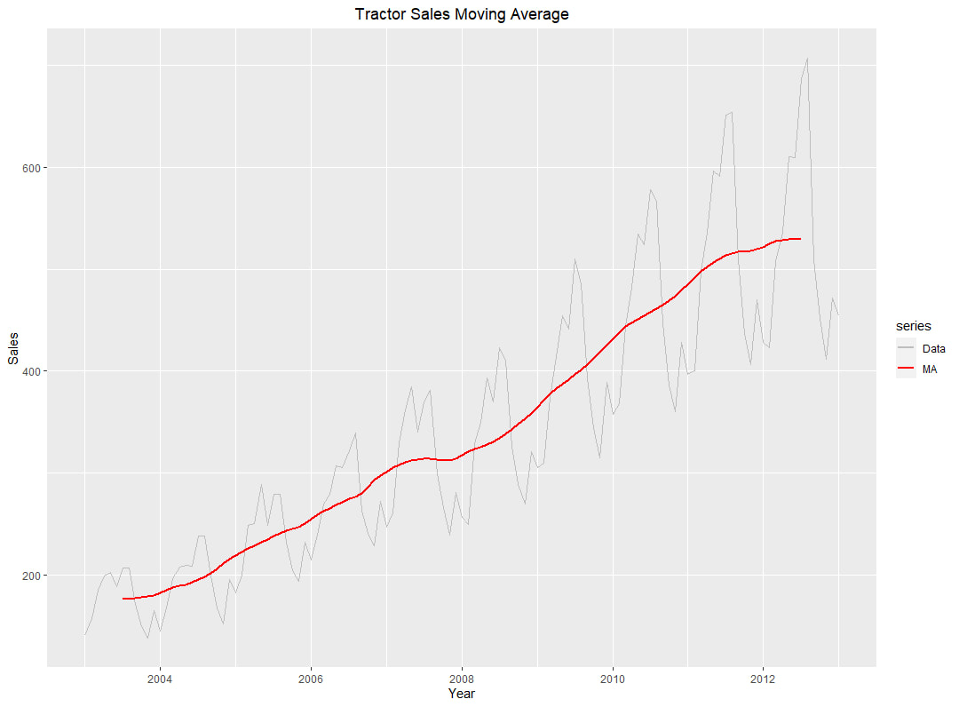
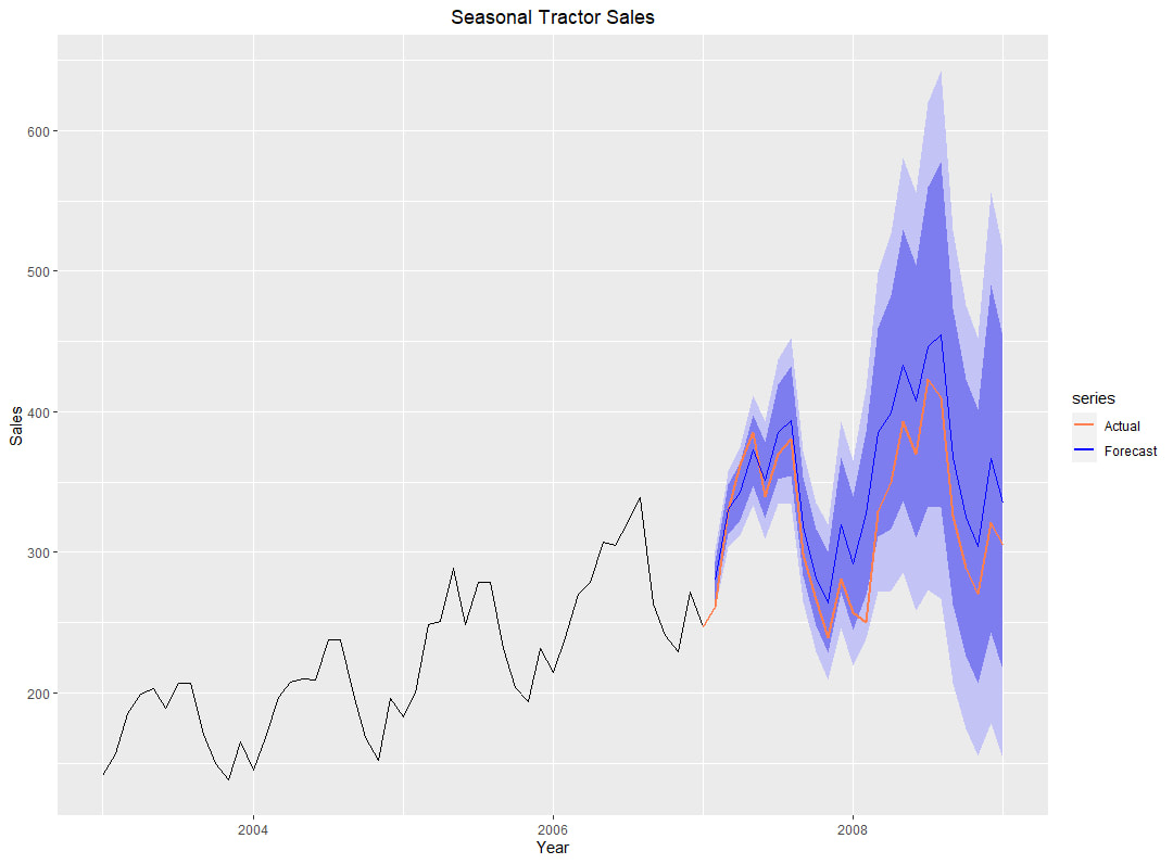
Time Series Analysis Often data can be affected by time whether it is seasonal or trending and it is possible to make inferences from this data. Shown in the first plot is a Moving Average which can give more a visual of trend. Also shown is a plot of monthly seasonal data using the Holt Winters method with 80% & 95% confidence intervals and the mean predicted value (in blue). These intervals are less reliable the further into the future predictions are made, hence the much wider confidence intervals. Below is an example of an interactive plot using the same data which can be adopted to view data projections via a webpage for internal presentations. This can show how well a model forecasts data based on the ARIMA algorithmn for differing past time periods. |
  |
